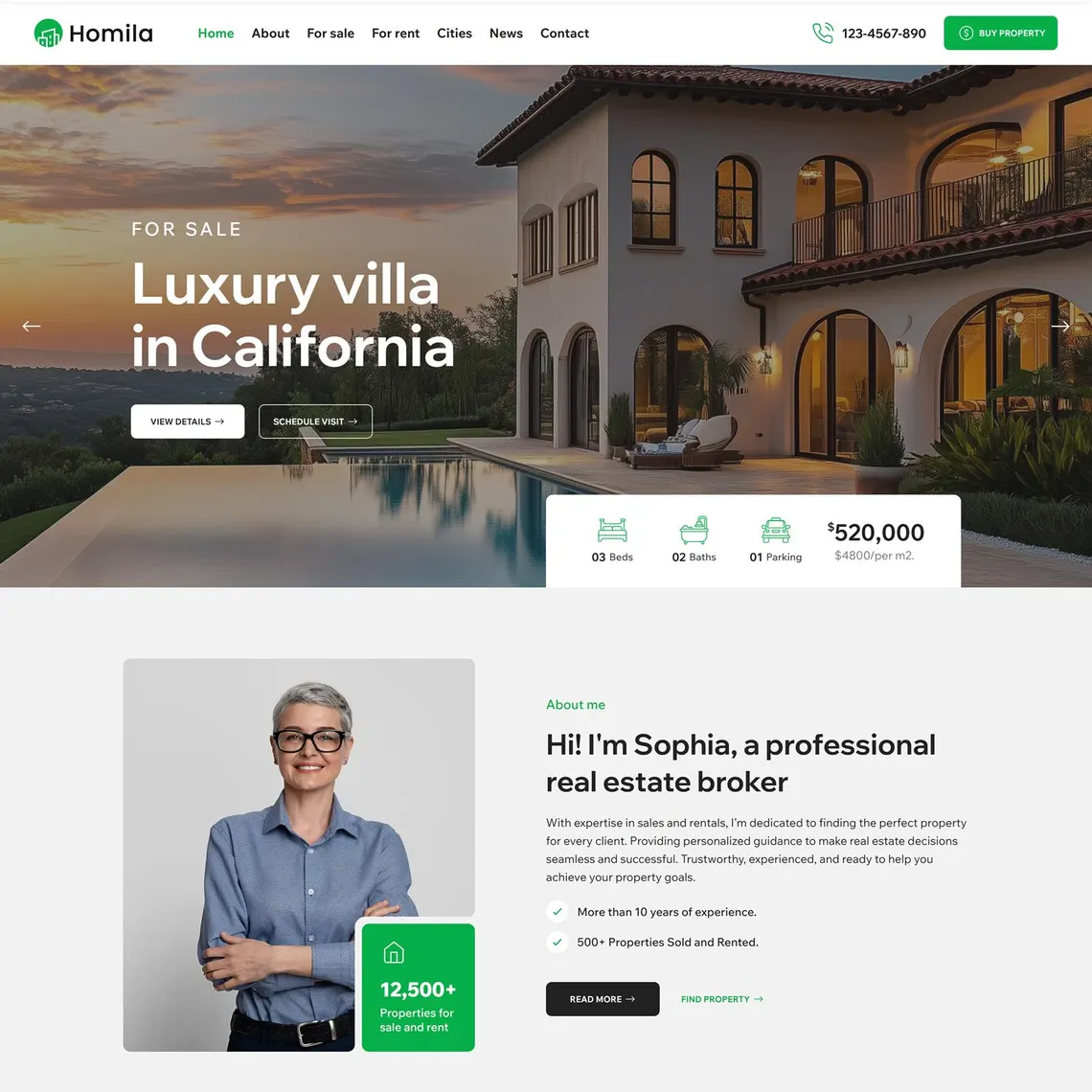

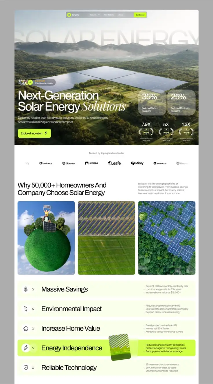
Two sites, same service, different outcomes
A bookkeeper in Centurion and a bookkeeper in Durban North both launch a new website the same month. Same industry, same target client, roughly the same budget. Six months later, one is fielding three qualified enquiries a week. The other is wondering why the "nice new site" changed nothing.
The difference was rarely the logo, the font or even the photography. It was whether a stranger, scrolling on a phone with one thumb, could work out in ten seconds who the site was for and what to do next. Everything downstream of that (proof, CTA placement, speed) only matters once that first test is passed.
This guide walks through the build order that actually protects a conversion outcome: offer first, structure second, proof and action third, speed and WhatsApp fourth, measurement running underneath all of it. Skip the order and you get a site that looks finished in a meeting and underperforms in the market.
The five layers, and where teams usually skip one
- 1 Offer Who you help, and what changes
- 2 Structure Right page for each intent
- 3 Trust Proof beside the ask
- 4 Action One obvious next step
- 5 Measurement Qualified enquiries, not sessions
| Layer | Job | Common failure |
|---|---|---|
| Offer | Say who you help and what changes for them | Vague "solutions" language nobody can repeat back |
| Structure | Route each visitor intent to the right page fast | Everything dumped on the homepage, thin service pages |
| Trust | Lower the perceived risk of contacting you | Generic stock photos, no specifics, no policies |
| Action | Make the next step obvious on every screen | Buried contact details, competing CTAs, dead-end forms |
| Measurement | Learn what is actually working | No events configured, "leads" undefined between marketing and sales |
Skip the template, write the sentence first
Before a single wireframe: who do you help, what problem do you solve, and what changes for them afterward? Write it as one sentence. If your ops manager and your sales lead would each phrase it differently, the site is about to inherit that disagreement, page by page.
Most SME homepages try to list everything the business can do. A visitor scanning on a mid-range Android phone during a lunch break does not have the patience to sort fifteen equally weighted services into "relevant to me" and "not." Rank your offers instead: one flagship service earns the headline, two or three earn their own pages, everything else lives a click deeper.
A construction fit-out company we spoke with once listed "renovations, new builds, maintenance, project management, consulting and design" across the hero with equal font weight. A commercial client with a leaking roof had no way to know which line to click. Naming the flagship service (commercial renovations) and demoting the rest fixed more of their enquiry problem than any redesign of the visuals did.
Homepage first-screen checklist (mobile)
- The offer and audience are readable without scrolling on a mid-range phone
- One primary CTA is visible and thumb-reachable
- A secondary contact path (WhatsApp or call) exists but does not compete visually
- At least one specific proof element sits above the fold or immediately below it
- Navigation does not block the first screen with a heavy menu or popup
- Hero copy answers "for whom" (not just "what") in plain language
Structure is a map, not a dumping ground
Information architecture decides which page answers which question. Done well, a visitor asking "do they handle a business my size, in my industry?" finds the answer within two clicks. Done badly, every visitor gets funnelled through the same generic homepage-to-contact path no matter what they actually came to check.
A service page that says "we do X" in one paragraph and then asks for a contact form barely counts as a page, call it a placeholder wearing a page's clothes. It will lose to any competitor who bothered to explain scope, process and fit.
How many top-level nav items is right? Fewer than you think. Three clearly labelled groups beat twelve items a visitor has to decode under time pressure. If you cannot explain your own navigation to a colleague in one sentence, a stranger has no chance.
Page-by-page conversion job
| Page | Primary job | Should never do |
|---|---|---|
| Homepage | Orient the visitor and route them to the right next page | Try to sell every service at once |
| Service page | Explain scope, fit and proof; convert the "considering" visitor | Stay generic to avoid writing real detail |
| About | Build credibility and humanise the team | Become the only place trust signals live |
| Contact | Capture the enquiry and set a response expectation | Ask for more information than you actually use |
| Blog / resources | Answer buying questions and support search visibility | Dilute the commercial spine of the site with noise |
Proof does not require a decade of case studies
Founders often assume they need glossy testimonials and big-name logos before they can claim any credibility. They do not. Specificity is what actually reassures a stranger, a clear description of your process, the types of clients you actually take on, your credentials, a stated response time, a written guarantee.
What you should never do is invent a number. If you do not have measurable results ready to publish, lean on process transparency and founder expertise instead. "Here is exactly how we work, and here is what we will not promise" reads as more credible than three unverifiable superlatives stacked in a hero banner, and it will not create a problem for you later when someone asks for the source.
Where you place proof matters as much as whether you have it. A specific detail sitting right beside your primary CTA does more conversion work than the same content three scrolls down on a page called "Testimonials" that almost nobody who is actively deciding will bother to find.
A realistic build sequence
- Write the commercial jobOne sentence describing who should do what after visiting. Everything else gets tested against it.
- Map must-have pagesSeparate launch-critical pages from later ideas. Resist scope creep before you have shipped anything.
- Design the trust and CTA modulesBuild these as reusable blocks so every service template carries consistent proof and a single dominant action.
- Instrument before launchConfigure GA4 key events for enquiries, calls and WhatsApp clicks (not just pageviews) before you send traffic.
- Review weekly, then monthlyWeekly: lead quality and obvious friction. Monthly: which pages and CTAs actually earn qualified contact.
Traffic is expensive. Confusion is a silent tax on every rand you spend to earn a visit.
Nexus conversion principle
Forget desktop-first thinking on speed and forms
A site that loads instantly on office fibre and a two-year-old MacBook can feel genuinely broken on a mid-range Android phone over patchy mobile data, and that gap is where a lot of South African SME traffic actually lives. Test on the devices your buyers use, not the one on your desk.
Pick a lane on WhatsApp versus forms rather than bolting both on as an afterthought. For plenty of South African service businesses, WhatsApp ranks as the channel buyers reach for first, well ahead of being some nice-to-have extra, and it deserves the same design care as a form: clear placement, a pre-filled message, a real person answering on the other end.
Every additional form field costs you completions. Ask only for what you will actually use to respond to or qualify the enquiry. The rest (budget range, exact scope, timeline) can be gathered in the reply conversation instead of demanded up front from someone who has not decided to trust you yet.
Measure qualified enquiries, not vanity traffic
When to redesign, and when to leave it alone
Iterate when the offer is sound, the navigation basically works, and the templates just need sharper proof, clearer CTAs or a speed fix. It is usually the faster, cheaper path, and it protects whatever search visibility the current site has already earned.
Redesign when the navigation genuinely cannot represent what you sell today, when the visual inconsistency or outdated content is actively damaging trust, or when a technical ceiling is blocking improvement no matter what copy changes you try. A redesign briefed against conversion goals will consistently beat one briefed around a moodboard.
Whichever you choose, plan redirects properly if the current site ranks for anything. A conversion-focused rebuild that quietly wipes out existing organic traffic has just swapped one problem for a more expensive one.
What to do next
This week: write the one-sentence offer, open your homepage on an actual phone and score the first screen, and confirm your primary conversion event fires correctly in GA4. Most sites improve measurably from these three moves before a single pixel changes.
Then: brief your service pages properly (scope, fit, proof, next step) and decide deliberately whether WhatsApp, forms or both carry your primary conversion path. Pair this guide with our lead-generation checklist and CRO guide for the next layer of detail.
Planning a new build or a redesign? Bring your offer, your must-have pages and your lead definition to the first conversation, before templates or timelines. That order protects the budget and the outcome.

.png)