
Nobody abandons a form because the page lacked a badge
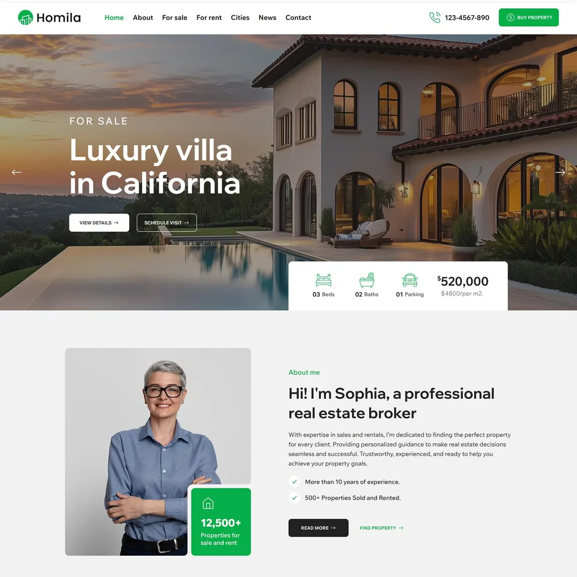
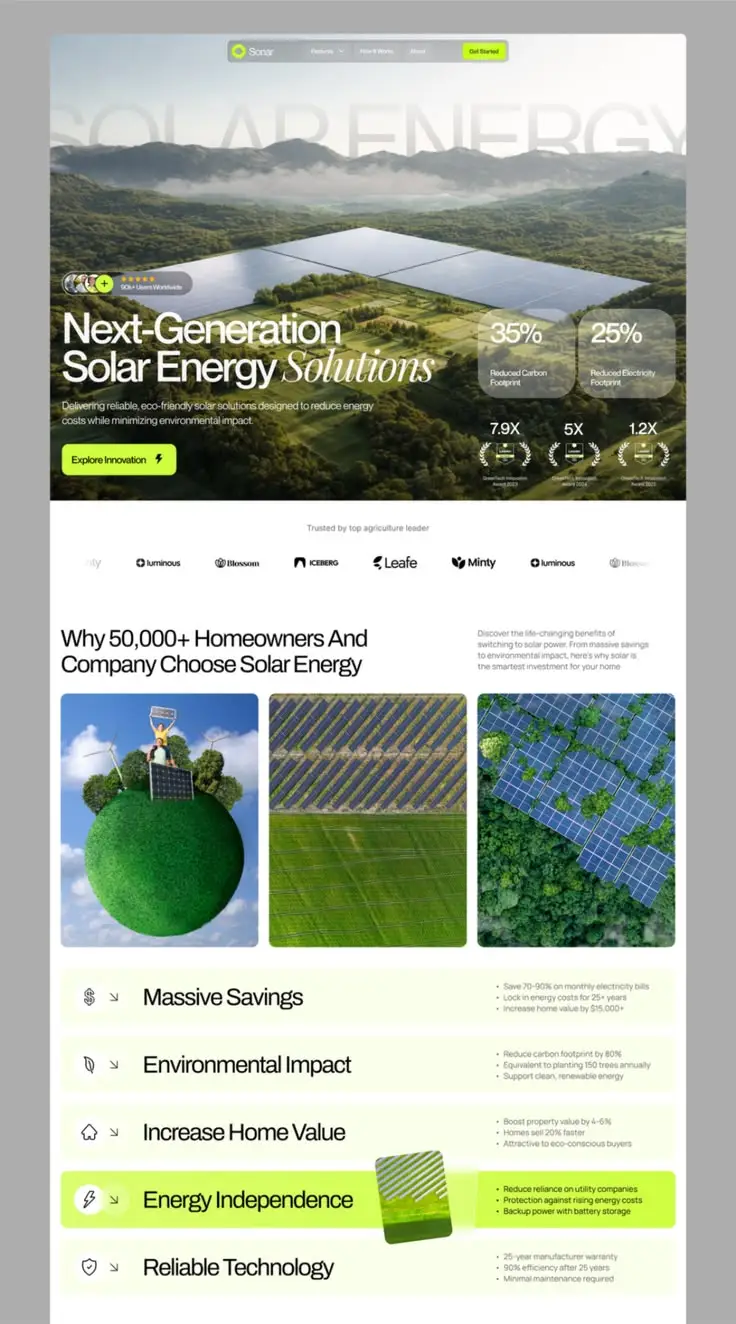
A common fix for "low conversion" is bolting a row of security badges and a client-logo strip onto a page and calling it a trust upgrade. Sometimes that helps a little. More often it does nothing, because the visitor’s actual hesitation was never "is this website secure enough", it was "will this business actually call me back," "is this price realistic for someone like me," or "has this company done this specific thing before, for a business like mine."
Trust signals work when they answer a real, specific question a visitor is silently holding at that exact point in the page. A generic five-star icon answers no question in particular, which is why it rarely moves a conversion rate on its own. A named case study answering "have you done this for someone in my industry" answers a real one, and that is the difference between decoration and a genuine lift in form completions.
Before adding any trust element, name the hesitation it is meant to remove. If you cannot state the specific doubt in one sentence, the signal is probably visual noise rather than a conversion lever.
Trust signals ranked by what they actually answer
| Signal type | Hesitation it answers | What weakens it |
|---|---|---|
| Specific client results or case studies | "Has this worked for a business like mine?" | Vague outcomes with no named context or industry |
| Real, verifiable reviews | "Do other real people vouch for this?" | Suspiciously perfect five-star scores with no negative or mixed reviews visible anywhere |
| Visible credentials and registration details | "Is this a legitimate, accountable business?" | Credentials that cannot be checked or verified anywhere |
| Transparent pricing or pricing logic | "Can I actually afford this, or is it a bait-and-switch?" | Hidden pricing that only appears after a form submission |
| Clear contact details and response promise | "Will a real person actually respond if I fill this in?" | A contact page with only a generic form and no phone, WhatsApp or named team |
| Recognised payment or security badges | "Is my card or data safe here?" | Badges from unfamiliar or unverifiable providers, which can read as fake |
Why vague testimonials underperform specific ones
"Great service, highly recommend!" attributed to "J.M." does very little for a sceptical visitor, because it could describe almost any business in any industry. It reads as filler even when it is completely genuine. A visitor scanning quickly does not register it as evidence, it barely registers at all.
A testimonial that names the industry, the specific problem solved, and a real (or at minimum plausible and attributable) name and business reads as evidence rather than decoration. "Our online store’s checkout abandonment dropped noticeably after Nexus rebuilt our product pages, [Name], [Business], [City]" gives a visitor something concrete to match against their own situation.
If you do not yet have detailed, specific testimonials, an honest short one beats an invented detailed one. Fabricating specificity to make a vague testimonial sound more convincing is exactly the kind of trust violation this entire topic is meant to prevent, and it tends to unravel the moment a curious visitor tries to verify it.
Where trust signals actually belong on the page
Trust signals scattered in a dedicated "Why choose us" section near the bottom of a page do less work than the same signals placed exactly where hesitation happens, beside the form, near the primary CTA, and at any point where a visitor is asked to commit something (an email address, a phone number, a card number).
Right above or beside a lead form, a short, specific line of proof (a client count, a response-time promise, or a one-line named result) reduces the exact hesitation a visitor feels in that moment. The same proof sitting only in a testimonials carousel higher up the page has often already scrolled out of memory by the time the visitor reaches the form.
On a checkout or payment step specifically, recognisable payment logos and a clear line about data handling matter more there than anywhere else on the site. That is the single highest-hesitation moment on an ecommerce journey, and it deserves its own dedicated trust treatment rather than relying on signals shown earlier in the visit.
South African visitors weigh a few signals more heavily
Contactability carries unusual weight here. A visible phone number, a working WhatsApp click-to-chat button and a real physical location (even if it is a service area, not a shopfront) address a specific, common local hesitation: "can I actually reach a person if something goes wrong." A form-only contact page, with no other visible way to reach a human, reads as riskier to a South African visitor than it might elsewhere.
Local proof also matters more than international logos for most SA SMEs. A visitor deciding between two web agencies is usually more reassured by "we have built forty sites for South African businesses like yours" than by an unfamiliar international award badge that means little locally. Match your proof to the market you are actually selling into.
Payment trust deserves specific local attention too. South African shoppers recognise PayFast, Yoco, SnapScan and familiar local bank logos more readily than unfamiliar global payment icons. On checkout pages, display the specific gateways you actually support rather than a generic "secure payment" badge that names nothing.
A practical sequence for auditing your trust signals
- List every hesitation a real visitor might haveCost, legitimacy, responsiveness, past results, data safety, write the actual doubts, not a generic list.
- Map your current proof against those hesitationsFor each doubt, find the specific element on your site that answers it. Gaps are where new proof is needed.
- Move proof next to the moment of commitmentRelocate your strongest, most specific proof beside the form or CTA, not only in a separate section higher up the page.
- Replace vague testimonials with specific onesRewrite or request testimonials that name the industry, the problem and the outcome, even briefly.
- Remove unverifiable or unfamiliar badgesA security badge nobody recognises can quietly reduce trust rather than build it, delete anything you cannot vouch for.
A worked example: the quote form that started converting
A Cape Town renovation contractor had a quote request form sitting near the bottom of a long services page, with a testimonials carousel higher up featuring three generic, unattributed quotes. Form completions were low, and the team assumed the form itself had too many fields.
The actual fix was smaller than a form redesign. We moved two specific, named project results directly above the form (one with a photo, a suburb and a rough project scope) added a visible WhatsApp button beside the submit button, and replaced the generic testimonials with two detailed, attributed ones tied to similar renovation types. The form did not get shorter. It got more trustworthy at the exact moment someone was deciding whether to fill it in.
Nothing here involved a redesign, a new logo or a badge purchase. It involved moving genuine proof to the point of hesitation and making it specific enough to matter. That sequencing (proof at the decision point, not just somewhere on the page) is usually worth more than any individual trust element added in isolation.
Trust signal mistakes worth checking for today
- Testimonials with no name, business or specific outcome attached
- Security or award badges from providers nobody on your team can actually name or verify
- No visible phone number, WhatsApp or physical presence anywhere on a contact-heavy page
- Trust proof placed only in one section, far from the actual form or CTA
- Perfect five-star review scores with no visible negative or mixed feedback anywhere, which can itself look manufactured
- Pricing hidden entirely behind a form on a page targeting cost-conscious, comparison-shopping visitors
Trust is not a section of the page. It is a running argument you make at every point a visitor might hesitate, and it needs to be winning that argument right where the form sits.
Jordan Blake, Web & Conversion Strategist
When trust signals can backfire
More proof is not always better proof. A page crowded with a dozen badges, five testimonials, three award icons and a client-logo strip can start to read as overcompensation, as though the business feels it needs to convince you unusually hard. A visitor can sense the difference between a page that quietly demonstrates credibility and one that is visibly straining to prove it.
Perfectly uniform five-star reviews with no visible mixed or critical feedback anywhere can also erode trust rather than build it, particularly with more sceptical buyers who have learned to distrust review sections that look curated. A visible three- or four-star review handled professionally, alongside your stronger ones, often reads as more credible than an unbroken wall of five stars.
Choose a small number of your strongest, most specific proof points and place them precisely at the moments of real hesitation, rather than distributing a large volume of moderate proof evenly across the page. Restraint, applied to genuinely strong evidence, usually outperforms volume applied to generic evidence.
What to do next
Audit one high-value page this week using the hesitation-mapping exercise above. Most sites have at least one easy win: a vague testimonial to rewrite, a badge to remove, or a piece of genuine proof sitting too far from the form to still be doing any work.
Treat trust signal placement as testable, not a one-time decoration pass. Moving your strongest proof closer to a CTA is a cheap, fast experiment compared with a full redesign, and it often produces a clearer, faster read on what is actually changing your form completion rate.
Nexus builds conversion-focused pages with proof placement designed in from the brief, not bolted on afterward. Read our conversion rate optimisation guide next, or bring us a page you suspect is losing trust it should be earning.
.png)
.png)